The UI is dead. Long live the UI.
At work, we think about how to integrate AI into the product in new meaningful ways a lot. One of the big challenges is, how do you get the UI right? What is the right UI in the age of AI? So, here are some thoughts on this topic on a broader scale.
In my opinion, we’re witnessing the early signs of a rapidly accelerating death of traditional user interfaces. That familiar world of fixed navigation bars, dropdown menus, and complex settings screens that have defined our digital experience for decades.
But what’s emerging isn’t a future without interfaces. It’s something far more interesting: a future where interfaces become contextual, ephemeral, and intelligent. Appearing exactly when needed and disappearing when not. 🫢
Most AI products today exist in their early state: a simple chat box where you type your request and receive a response. Imagine someone designing such a thing outside the context of AI. It would like something completely unfinished and boring.
But this simple interface is only a mask to all the magic transformations that are happening beneath the surface. All complexities are hidden away, and you get it in an easy, digestible form. Mostly text!
I think this is now triggering a complete rethinking of how humans interact with software. 
The Friction of the Old World
We live in an era of “death by a thousand clicks.” In our day-to-day we got used to navigating a labyrinth of specialized SaaS applications, each with its own unique interface, navigation patterns, and mental model.
Consider a typical product manager’s morning:
Open Linear to check sprint progress
Switch to Slack to respond to team questions
Jump to Figma to review design updates
Move to Google Docs to update the product spec
Shift to Posthog to check user metrics
Toggle back to Slack because of notifications
Open Notion to update the product roadmap
Each context switch carries a cognitive tax. Each application requires you to remember its unique patterns and workflows (Just today I got some fun questions about some quirks of Notion). Where’s that setting again? How do I filter this view? What was the keyboard shortcut for this action?
Because of all this switching, it’s also quite challenging to get into a good flow state. I personally only achieve this when I work a longer task in one tool only.
The problem isn’t just the number of applications — it’s that each one forces you to adapt to it own world rather than adapting to yours. Each tool often makes perfect sense in isolation but creates overwhelming complexity when having to jump often.
The Catalyst: AI as a Universal Translator
This is where AI enters — not just as a content generator, but as an orchestrator and universal translator between often independent systems.
MCPs (Model Context Protocol) are an amazing way of making ANY API digestible by a LLM. The AI can now aggregate that data from different sources, all into one interface.
That means you can get some data from a Spreadsheet, cross-reference it with a list of Tickets you might have in Linear, and some documents you wrote lying around in Google Drive.
The key insight: AI can understand both human intent and the underlying data structures of different applications. It can translate between all of them, pulling all the information and transform it into one cohesive bit of information.
This fundamentally breaks the old model where each product required its own bespoke UI. In theory, that interface should be a sum of three radically different UIs. But I don’t think that would fly well.
So the interface for all these things needs to be standardized.
The New Paradigm: The “smart Canvas”
The emerging paradigm isn’t “no UI” — it’s what I call the ”smart Canvas”. This is a flexible, adaptable space where interface elements appear contextually based on user intent.
Notion provides our best current example. Its canvas starts as a blank page, but through simple commands (/table, /board, /gallery), you can place exactly the interface element you need at that moment. The container remains simple and predictable, while the content within it becomes dynamic and context-specific. (I do admire Notion for this a lot, and many products have adopted some of the unique approaches of Notion.)
This smart Canvas represents a profound shift in UI philosophy:
From permanent to ephemeral: Interface elements appear when needed and disappear when not
From predetermined to contextual: The UI adapts to what you’re trying to accomplish
From exploration to intention: You don’t browse through options; you express what you want
What makes this work are what I would call “UI Snippets” — small, single-purpose interface elements that an AI can surface on the canvas as needed. Here are some examples I can think of
A list of tickets that show the information you need and allow toggling information
A small data table used to analyze information and sort it
A picker to assign tasks to someone (I don’t want to write all these things down all the time)
A date selector if you need to set a deadline.
A textbox that allows you to edit a draft AI created for you right there, and then process it further from there with the next command.
Today, everything in AI chat interfaces still feels fairly static, but we’ll evolve from there. The important part is that the complexity is hidden until the exact moment it’s needed, and then only the necessary piece is shown. This dramatically reduces cognitive load while maintaining the precision of purpose-built interfaces when required.
I think in the future over the next 2-3 years, we’ll see very fluid, purposefully animated and very elastic user interfaces. It’s about showing and hiding the information in helpful but appealing ways… and probably thanks to Apple, way too much Glass stuff.
The New Interaction: From Clicks to Intent
Alongside this shift in interface composition comes a parallel shift in interaction models. From mouse-driven exploration to keyboard-driven intent.
Everyone using tools like Raycast and command palettes, or hardcore vim users will feel right at home. (Well… not so sure about vim users tbh)
The command palette (Cmd+K, sometimes referred to as kbar) has evolved from a power-user feature in apps like Superhuman and Linear to a mainstream expectation. It represents a fundamental shift from browsing and finding the action to commanding where to go and what to do. It went from exploring what’s possible to expressing what you want.
This evolution will accelerate with natural language commands. You won’t just be searching: you’ll be doing. “Assign this task to Alex and set the due date for Friday” will become as natural as clicking through a series of menus and dialogs—but far more efficient.
The progression looks something like this:
Click-driven interfaces: Navigate through visual hierarchies to find what you need (Traditional UIs)
Command palette interfaces: Type a command or search term to quickly access functionality (Superhuman, Linear)
Natural language interfaces: Express your intent in plain language (Emerging AI UIs)
Predictive interfaces: The system anticipates your needs and presents options before you ask (Future. I hope)
What makes this particularly powerful is that natural language removes the need to learn specific application syntax. The same command “Show me our active projects” should work whether you’re in Linear, Jira, Asana, Monday, or any other project management tool.
Following are some nice examples for how Interfaces evolve in our daily tools.
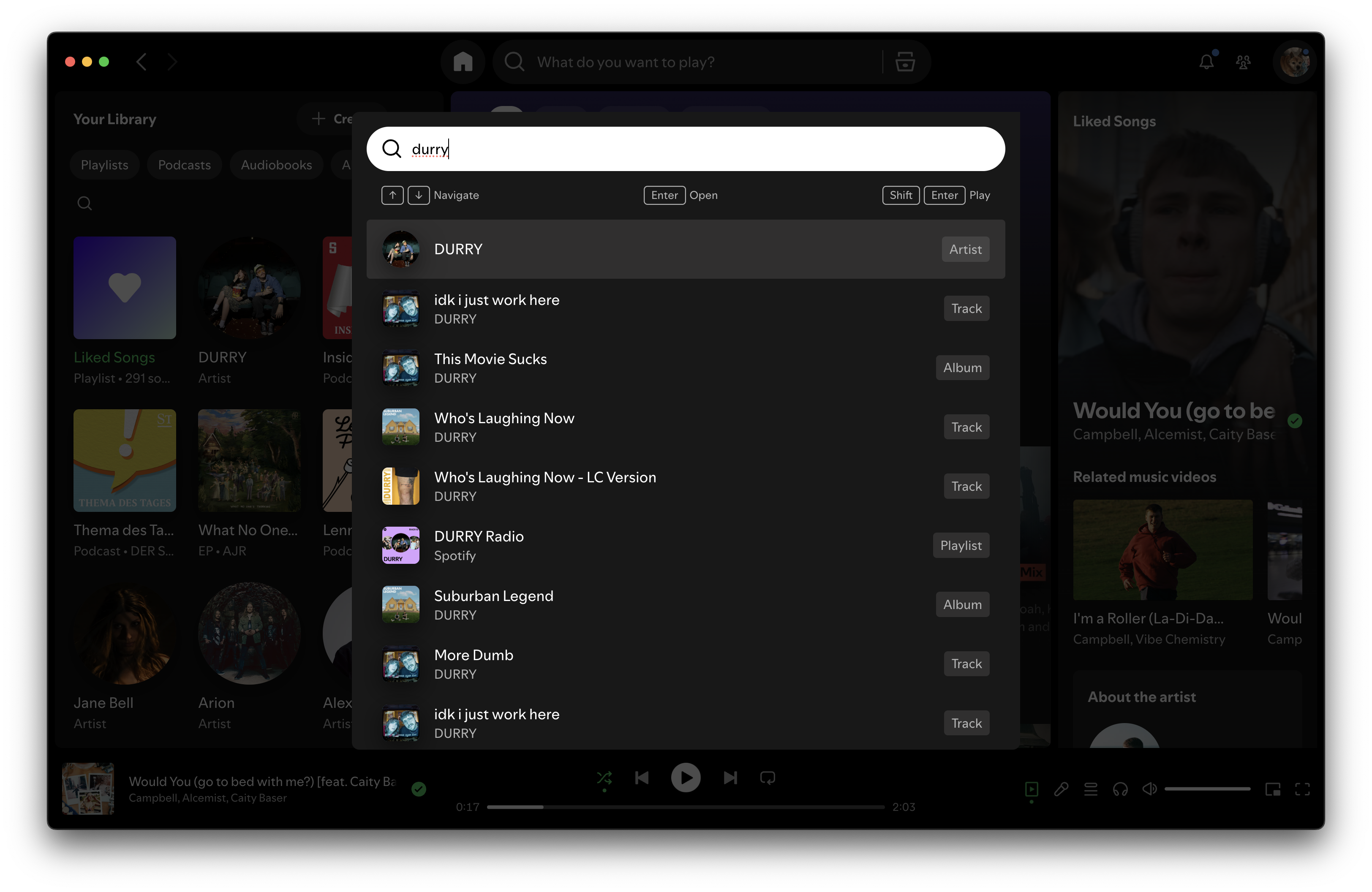
Command Pallet lets me jump to what I actually want much quicker than any UI.

Dia Browsers AI let’s me reference elements like the Video I have open, analyze it and gives me nice marker to jump to certain scenes
Designing for the Next Decade
As we’re moving from the classic multipage applications to these new canvases, my bet is that a few companies will achieve some gold-standard UI breakthroughs, everyone will take for granted.
I think for designers, it’s now the time to rethink old habbits and learnings and start designing for the next decade. It will be about deconstruction, simplicity and clarity.
Rather than building monolithic applications with comprehensive UIs and slowly evolving design systems, they’ll create flexible systems of UI snippets that can be assembled and disassembled based on user needs.
So here’s my suggestion and expectation on that matter:
🎨 Design for intent, not for features: Start with what users are trying to accomplish, not with what your product can do
🫂 Embrace ephemerality: Don’t try to show everything at once; show exactly what’s needed at each moment
🧠 Think in components, not screens: Build modular UI elements that can be composed in different ways
📑 Design for context: Consider how the same information might be presented differently depending on the user’s current task
🏎️ Prioritize speed: In an intent-driven world, the time between expressing intent and seeing results becomes critical
The traditional UI isn’t disappearing overnight. Not everything is moving that fast. Complex tools will still require structured interfaces for years to come. But the direction is clear: we’re moving toward a world where interfaces become increasingly invisible.
Not because they don’t exist, but because they appear exactly when needed and disappear when not.
I for one am absolutely excited for what’s to come. I love that things go back to substance over style. Make my UIs simple, and my tools powerful. That’s all I am asking for.
I know, I will make that.
The UI is dead. Long live the UI.